BasicTable 表格
使用场景
- 数据展示:表格是最常见的数据展示方式之一。无论是静态数据还是动态数据,表格都可以清晰、直观地展示数据间的关系和对比。例如,用户列表、订单信息、销售数据等都可以通过表格来展示。
- 数据操作:表格不仅仅用于展示数据,还可以配合其他组件实现数据的增删改查等操作。例如,通过点击表格的某一行,可以展示更详细的信息;通过点击按钮,可以实现数据的删除或修改等。
- 数据筛选和排序:对于大量的数据,用户可能只关心其中的一部分。这时,可以通过表格的筛选和排序功能,快速找到需要的数据。例如,通过筛选功能,只显示符合特定条件的数据;通过排序功能,将数据按照某一列的值进行排序。
基本用法
最基本的用法可以和ant design 的table组件一样使用 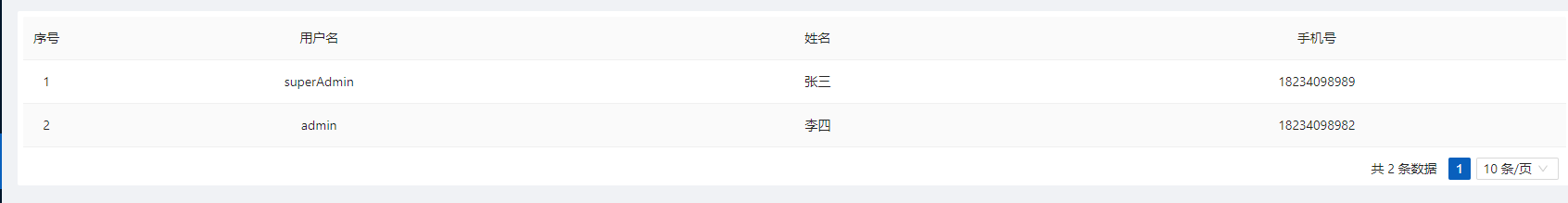
<template>
  <PageWrapper>
    <BasicTable :columns="columns" :dataSource="dataSource" />
  </PageWrapper>
</template>
<script setup>
  import { BasicTable } from '/@/components/Table';
  import { ref } from 'vue';
  const columns = [
    {
      title: '用户名',
      dataIndex: 'userName',
    },
    {
      title: '姓名',
      dataIndex: 'realName',
    },
    {
      title: '手机号',
      dataIndex: 'mobilePhone',
    },
  ];
  const dataSource = ref([
    {
      id: '1',
      userName: 'superAdmin',
      realName: '张三',
      mobilePhone: '18234098989',
    },
    {
      id: '2',
      userName: 'admin',
      realName: '李四',
      mobilePhone: '18234098982',
    },
  ]);
</script>
当然,vben框架对其进行了封装,有新的使用方式
<template>
  <PageWrapper>
    <BasicTable @register="register" />
  </PageWrapper>
</template>
<script setup>
  import { BasicTable, useTable } from '/@/components/Table';
  import { ref } from 'vue';
  const columns = [
    {
      title: '用户名',
      dataIndex: 'userName',
    },
    {
      title: '姓名',
      dataIndex: 'realName',
    },
    {
      title: '手机号',
      dataIndex: 'mobilePhone',
    },
  ];
  const dataSource = ref([
    {
      id: '1',
      userName: 'superAdmin',
      realName: '张三',
      mobilePhone: '18234098989',
    },
    {
      id: '2',
      userName: 'admin',
      realName: '李四',
      mobilePhone: '18234098982',
    },
  ]);
  const [register] = useTable({
    columns: columns,
    dataSource: dataSource,
  });
</script>
远程加载数据
通过 ajax api请求的方式加载数据
<template>
  <PageWrapper>
    <BasicTable @register="register" />
  </PageWrapper>
</template>
<script setup>
  import { BasicTable, useTable } from '/@/components/Table';
  import { sysUserPage } from '/@/api/sys/user';
  const columns = [
    {
      title: '用户名',
      dataIndex: 'userName',
    },
    {
      title: '姓名',
      dataIndex: 'realName',
    },
    {
      title: '手机号',
      dataIndex: 'mobilePhone',
    },
  ];
  const [register] = useTable({
    columns: columns,
    api: sysUserPage,
  });
</script>
自定义渲染列
使用渲染函数
<template>
  <PageWrapper>
    <BasicTable @register="register" />
  </PageWrapper>
</template>
<script setup>
  import { BasicTable, useTable } from '/@/components/Table';
  import { sysUserPage } from '/@/api/sys/user';
  import { h } from 'vue';
  import { Tag } from 'ant-design-vue';
  const columns = [
    {
      title: '用户名',
      dataIndex: 'userName',
    },
    {
      title: '姓名',
      dataIndex: 'realName',
    },
    {
      title: '手机号',
      dataIndex: 'mobilePhone',
    },
    {
      title: '性别',
      dataIndex: 'sex',
      customRender({ text }) {
        let s = text;
        let color = undefined;
        if (text == 1) {
          s = '男';
          color = 'blue';
        } else if (text == 2) {
          s = '女';
          color = 'red';
        } else {
          s = '未知';
        }
        return h(
          Tag,
          {
            color,
          },
          {
            default() {
              return s;
            },
          },
        );
      },
    },
  ];
  const [register] = useTable({
    columns: columns,
    api: sysUserPage,
  });
</script>
使用插槽
<template>
  <PageWrapper>
    <BasicTable @register="register">
      <template #sex="{ text }">
        <a-tag v-if="text == 1" color="blue">男</a-tag>
        <a-tag v-else-if="text == 2" color="red">女</a-tag>
        <a-tag v-else>未知</a-tag>
      </template>
    </BasicTable>
  </PageWrapper>
</template>
<script setup>
  import { BasicTable, useTable } from '/@/components/Table';
  import { sysUserPage } from '/@/api/sys/user';
  const columns = [
    {
      title: '用户名',
      dataIndex: 'userName',
    },
    {
      title: '姓名',
      dataIndex: 'realName',
    },
    {
      title: '手机号',
      dataIndex: 'mobilePhone',
    },
    {
      title: '性别',
      dataIndex: 'sex',
      slots: { customRender: 'sex' },
    },
  ];
  const [register] = useTable({
    columns: columns,
    api: sysUserPage,
  });
</script>
使用组件配置项
注:这个vben默认没有,本快速开发框架已改造支持。
<template>
  <PageWrapper>
    <BasicTable @register="register" />
  </PageWrapper>
</template>
<script setup>
  import { BasicTable, useTable } from '/@/components/Table';
  import { sysUserPage } from '/@/api/sys/user';
  const columns = [
    {
      title: '用户名',
      dataIndex: 'userName',
    },
    {
      title: '姓名',
      dataIndex: 'realName',
    },
    {
      title: '手机号',
      dataIndex: 'mobilePhone',
    },
    {
      title: '性别',
      dataIndex: 'sex',
      component: 'ApiDict',
      componentProps: {
        code: 'sex',
      },
    },
  ];
  const [register] = useTable({
    columns: columns,
    api: sysUserPage,
  });
</script>
权限列
通过auth 或者ifShow来控制列 或者 操作列的显隐
auth权限码
<template>
  <PageWrapper>
    <BasicTable @register="register" />
  </PageWrapper>
</template>
<script setup>
  import { BasicTable, useTable } from '/@/components/Table';
  import { sysUserPage } from '/@/api/sys/user';
  const columns = [
    {
      title: '用户名',
      dataIndex: 'userName',
    },
    {
      title: '姓名',
      dataIndex: 'realName',
    },
    {
      title: '手机号',
      dataIndex: 'mobilePhone',
    },
    {
      title: '性别',
      dataIndex: 'sex',
      component: 'ApiDict',
      componentProps: {
        code: 'sex',
      },
      auth: 'admin', // 显示
      // auth: 'adminxxxx', // 隐藏
    },
  ];
  const [register] = useTable({
    columns: columns,
    api: sysUserPage,
  });
</script>
ifShow函数
<template>
  <PageWrapper>
    <BasicTable @register="register">
      <template #mm-sex="{ text }">
        <a-tag v-if="text == 1" color="blue">男</a-tag>
        <a-tag v-else-if="text == 2" color="red">女</a-tag>
        <a-tag v-else>未知</a-tag>
      </template>
    </BasicTable>
  </PageWrapper>
</template>
<script setup>
  import { BasicTable, useTable } from '/@/components/Table';
  import { sysUserPage } from '/@/api/sys/user';
  import { usePermission } from '/@/hooks/web/usePermission';
  const { hasPermission } = usePermission();
  const columns = [
    {
      title: '用户名',
      dataIndex: 'userName',
    },
    {
      title: '姓名',
      dataIndex: 'realName',
    },
    {
      title: '手机号',
      dataIndex: 'mobilePhone',
    },
    {
      title: '管理员类型',
      dataIndex: 'adminType',
      component: 'ApiDict',
      componentProps: {
        code: 'sys_user_admin_type',
      },
      auth: ['admin', 'adminxxx'], // 拥有admin或adminxxx权限码的用户才能看到
    },
    {
      title: '性别',
      dataIndex: 'sex',
      slots: { customRender: 'mm-sex' },
      ifShow() {
        return hasPermission('adminxx');
      },
    },
  ];
  const [register] = useTable({
    showIndexColumn: false, // 是否显示序号
    columns: columns, // 表格列配置
    showTableSetting: true, // 是否显示表格设置
    api: sysUserPage, // 表格请求数据接口
  });
</script>
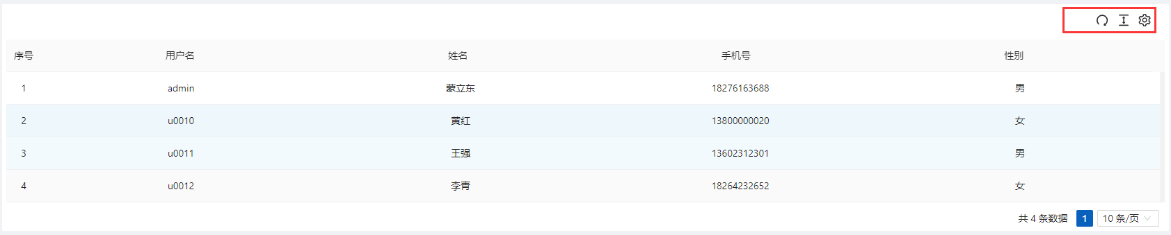
表格设置工具
showTableSetting显示表格设置工具 默认值false tableSetting表格设置工具配置
{
  // 是否显示刷新按钮
  redo?: boolean;
  // 是否显示尺寸调整按钮
  size?: boolean;
  // 是否显示字段调整按钮
  setting?: boolean;
  // 是否显示全屏按钮
  fullScreen?: boolean;
}
<template>
  <PageWrapper>
    <BasicTable @register="register" />
  </PageWrapper>
</template>
<script setup>
  import { BasicTable, useTable } from '/@/components/Table';
  import { sysUserPage } from '/@/api/sys/user';
  const columns = [
    {
      title: '用户名',
      dataIndex: 'userName',
    },
    {
      title: '姓名',
      dataIndex: 'realName',
    },
    {
      title: '手机号',
      dataIndex: 'mobilePhone',
    },
    {
      title: '性别',
      dataIndex: 'sex',
      component: 'ApiDict',
      componentProps: {
        code: 'sex',
      },
    },
  ];
  const [register] = useTable({
    columns: columns,
    api: sysUserPage,
    showTableSetting: true, // 显示表格设置工具
  });
</script>
开启表单搜索
vben对表格的封装已支持表单搜索配置,下面我们演示如何配置
<template>
  <PageWrapper>
    <BasicTable @register="register" />
  </PageWrapper>
</template>
<script setup>
  import { BasicTable, useTable } from '/@/components/Table';
  import { sysUserPage } from '/@/api/sys/user';
  const columns = [
    {
      title: '用户名',
      dataIndex: 'userName',
    },
    {
      title: '姓名',
      dataIndex: 'realName',
    },
    {
      title: '手机号',
      dataIndex: 'mobilePhone',
    },
    {
      title: '性别',
      dataIndex: 'sex',
      component: 'ApiDict',
      componentProps: {
        code: 'sex',
      },
    },
  ];
  const searchFormSchema = [
    {
      field: 'm_LIKE_userName',
      label: '用户名',
      component: 'Input',
      colProps: {
        xl: 6,
        xxl: 6,
      },
      componentProps: {
        placeholder: '请输入用户名',
      },
    },
  ];
  const [register] = useTable({
    columns: columns,
    api: sysUserPage,
    showTableSetting: true,
    useSearchForm: true, // 启用搜索表单
    formConfig: { // 搜索表单配置
      labelWidth: 100,
      schemas: searchFormSchema,
    },
  });
</script>
请求处理
请求之前对参数进行处理
<template>
  <PageWrapper>
    <BasicTable @register="register" />
  </PageWrapper>
</template>
<script setup>
  import { BasicTable, useTable } from '/@/components/Table';
  import { sysUserPage } from '/@/api/sys/user';
  const columns = [
    {
      title: '用户名',
      dataIndex: 'userName',
    },
    {
      title: '姓名',
      dataIndex: 'realName',
    },
    {
      title: '手机号',
      dataIndex: 'mobilePhone',
    },
    {
      title: '性别',
      dataIndex: 'sex',
      component: 'ApiDict',
      componentProps: {
        code: 'sex',
      },
    },
  ];
  const searchFormSchema = [
    {
      field: 'm_LIKE_userName',
      label: '用户名',
      component: 'Input',
      colProps: {
        xl: 6,
        xxl: 6,
      },
      componentProps: {
        placeholder: '请输入用户名',
      },
    },
  ];
  const [register] = useTable({
    columns: columns,
    api: sysUserPage,
    showTableSetting: true,
    useSearchForm: true,
    formConfig: {
      labelWidth: 100,
      schemas: searchFormSchema,
    },
    beforeFetch(params) {
      // 请求前对参数进行处理
      return {
        ...params,
        test: '测试参数',
      };
    },
  });
</script>
请求之后对返回值进行处理
<template>
  <PageWrapper>
    <BasicTable @register="register" />
  </PageWrapper>
</template>
<script setup>
  import { BasicTable, useTable } from '/@/components/Table';
  import { sysUserPage } from '/@/api/sys/user';
  const columns = [
    {
      title: '用户名',
      dataIndex: 'userName',
    },
    {
      title: '姓名',
      dataIndex: 'realName',
    },
    {
      title: '手机号',
      dataIndex: 'mobilePhone',
    },
    {
      title: '性别',
      dataIndex: 'sex',
      component: 'ApiDict',
      componentProps: {
        code: 'sex',
      },
    },
    {
      title: '性别(处理值)',
      dataIndex: 'sexText',
    },
  ];
  const searchFormSchema = [
    {
      field: 'm_LIKE_userName',
      label: '用户名',
      component: 'Input',
      colProps: {
        xl: 6,
        xxl: 6,
      },
      componentProps: {
        placeholder: '请输入用户名',
      },
    },
  ];
  const [register] = useTable({
    columns: columns,
    api: sysUserPage,
    showTableSetting: true,
    useSearchForm: true,
    formConfig: {
      labelWidth: 100,
      schemas: searchFormSchema,
    },
    afterFetch(data) {
      // 请求成功后处理数据
      return data?.map((item) => {
        return {
          sexText: item.sex === 1 ? '男' : item.sex === 2 ? '女' : '未知',
          ...item,
        };
      });
    },
  });
</script>
操作项
在ant design的表格组件中,为了增加操作项,我们通常需要自定义操作项的渲染列。而vben框架对ant design的表格组件进行了封装,并额外添加了操作项组件,这使得操作项的配置变得更为简便和直观。
<template>
  <PageWrapper>
    <BasicTable @register="register">
      <template #mm-sex="{ text }">
        <a-tag v-if="text == 1" color="blue">男</a-tag>
        <a-tag v-else-if="text == 2" color="red">女</a-tag>
        <a-tag v-else>未知</a-tag>
      </template>
      <template #action="{ record }">
        <TableAction
          :actions="[
            {
              label: '编辑1',
              onClick: handleEdit.bind(null, record),
            },
            {
              label: '删除1',
              color: 'error',
              popConfirm: {
                title: '是否确认删除',
                confirm: handleDelete.bind(null, record),
              },
            },
          ]"
          :dropDownActions="[
            {
              label: '编辑2',
              onClick: handleEdit.bind(null, record),
            },
            {
              label: '删除2',
              color: 'error',
              popConfirm: {
                title: '是否确认删除',
                confirm: handleDelete.bind(null, record),
              },
            },
          ]"
        />
      </template>
    </BasicTable>
  </PageWrapper>
</template>
<script setup>
  import { BasicTable, useTable, TableAction } from '/@/components/Table';
  import { sysUserPage } from '/@/api/sys/user';
  const columns = [
    {
      title: '用户名',
      dataIndex: 'userName',
    },
    {
      title: '姓名',
      dataIndex: 'realName',
    },
    {
      title: '手机号',
      dataIndex: 'mobilePhone',
    },
    {
      title: '管理员类型',
      dataIndex: 'adminType',
      component: 'ApiDict',
      componentProps: {
        code: 'sys_user_admin_type',
      },
    },
    {
      title: '性别',
      dataIndex: 'sex',
      slots: { customRender: 'mm-sex' },
    },
    {
      title: '性别(处理值)',
      dataIndex: 'sexText',
    },
    {
      title: '操作',
      dataIndex: 'action',
      slots: { customRender: 'action' },
    },
  ];
  const searchFormSchema = [
    {
      field: 'm_LIKE_userName',
      label: '用户名',
      component: 'Input',
      colProps: {
        xl: 6,
        xxl: 6,
      },
      componentProps: {
        placeholder: '请输入用户名',
      },
    },
    {
      field: 'm_IN_adminType',
      label: '管理员类型',
      component: 'ApiDict',
      colProps: {
        xl: 6,
        xxl: 6,
      },
      componentProps: {
        placeholder: '请选择管理员类型',
        code: 'sys_user_admin_type',
        mode: 'tags',
      },
    },
  ];
  const [register] = useTable({
    showIndexColumn: false, // 是否显示序号
    columns: columns, // 表格列配置
    showTableSetting: true, // 是否显示表格设置
    api: sysUserPage, // 表格请求数据接口
    useSearchForm: true, // 启用搜索表单
    searchInfo: {
      // 静态参数
      test: 'test111',
    },
    formConfig: {
      labelWidth: 100,
      schemas: searchFormSchema,
    },
    beforeFetch: (params) => {
      // 请求之前,重写参数,或者追加参数
      return {
        ...params,
        test: 'test222',
        test3: 'test333',
      };
    },
    afterFetch(data) {
      // 请求成功后处理数据
      return data?.map((item) => {
        return {
          sexText: item.sex === 1 ? '男' : item.sex === 2 ? '女' : '未知',
          ...item,
        };
      });
    },
  });
  const handleEdit = (record) => {
    console.log(record);
  };
  const handleDelete = (record) => {
    console.log(record);
  };
</script>
常用插槽
表格区域
| tableTitle | 表格顶部左侧区域 | |
|---|---|---|
| toolbar | 表格顶部右侧区域 | |
| expandedRowRender | 展开行区域 | |
| headerTop | 表格顶部区域(标题上方) | 2.6.1 |
自定义渲染列
Form-Slots
当开启 form 表单后。以form-xxxx为前缀的 slot 会被视为 form 的 slot xxxx 为 form 组件的 slot。具体参考form 组件文档 e.g
form-submitBefore
ref和methods
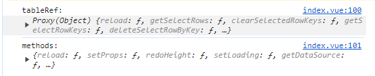
<template>
  <PageWrapper>
    <BasicTable @register="register" ref="tableRef">
      <template #action="{ record }">
        <TableAction
          :actions="[
            {
              label: '编辑',
              onClick: handleEdit.bind(null, record),
            },
            {
              label: '删除',
              color: 'error',
              popConfirm: {
                title: '是否确认删除',
                confirm: handleDelete.bind(null, record),
              },
            },
          ]"
        />
      </template> </BasicTable
  ></PageWrapper>
</template>
<script setup>
  import { BasicTable, useTable, TableAction } from '/@/components/Table';
  import { sysUserPage } from '/@/api/sys/user';
  import { ref, onMounted } from 'vue';
  const tableRef = ref();
  const columns = [
    {
      title: '用户名',
      dataIndex: 'userName',
    },
    {
      title: '姓名',
      dataIndex: 'realName',
    },
    {
      title: '手机号',
      dataIndex: 'mobilePhone',
    },
    {
      title: '性别',
      dataIndex: 'sex',
      component: 'ApiDict',
      componentProps: {
        code: 'sex',
      },
    },
    {
      title: '性别(处理值)',
      dataIndex: 'sexText',
    },
    {
      title: '操作',
      dataIndex: 'ACTION',
      slots: { customRender: 'action' },
    },
  ];
  const searchFormSchema = [
    {
      field: 'm_LIKE_userName',
      label: '用户名',
      component: 'Input',
      colProps: {
        xl: 6,
        xxl: 6,
      },
      componentProps: {
        placeholder: '请输入用户名',
      },
    },
  ];
  const [register, methods] = useTable({
    columns: columns,
    api: sysUserPage,
    showTableSetting: true,
    useSearchForm: true,
    formConfig: {
      labelWidth: 100,
      schemas: searchFormSchema,
    },
    afterFetch(data) {
      // 请求成功后处理数据
      return data?.map((item) => {
        return {
          sexText: item.sex === 1 ? '男' : item.sex === 2 ? '女' : '未知',
          ...item,
        };
      });
    },
  });
  const handleEdit = (record) => {
    console.log(record);
  };
  const handleDelete = (record) => {
    console.log(record);
  };
  onMounted(() => {
    console.log('tableRef:', tableRef.value);
    console.log('methods:', methods);
  });
</script>